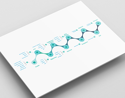
Identity designed to convey a story. Maybe more than one. This is also up to you! Story about how we, humans, can perceive a visual voice differently without a key piece of information, but once the information about “the missing piece” is shared, you will never again be able to see the image in quite the same way again.
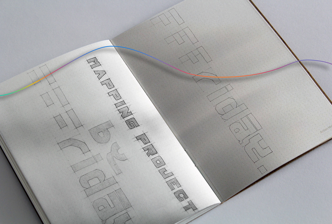
Sketch
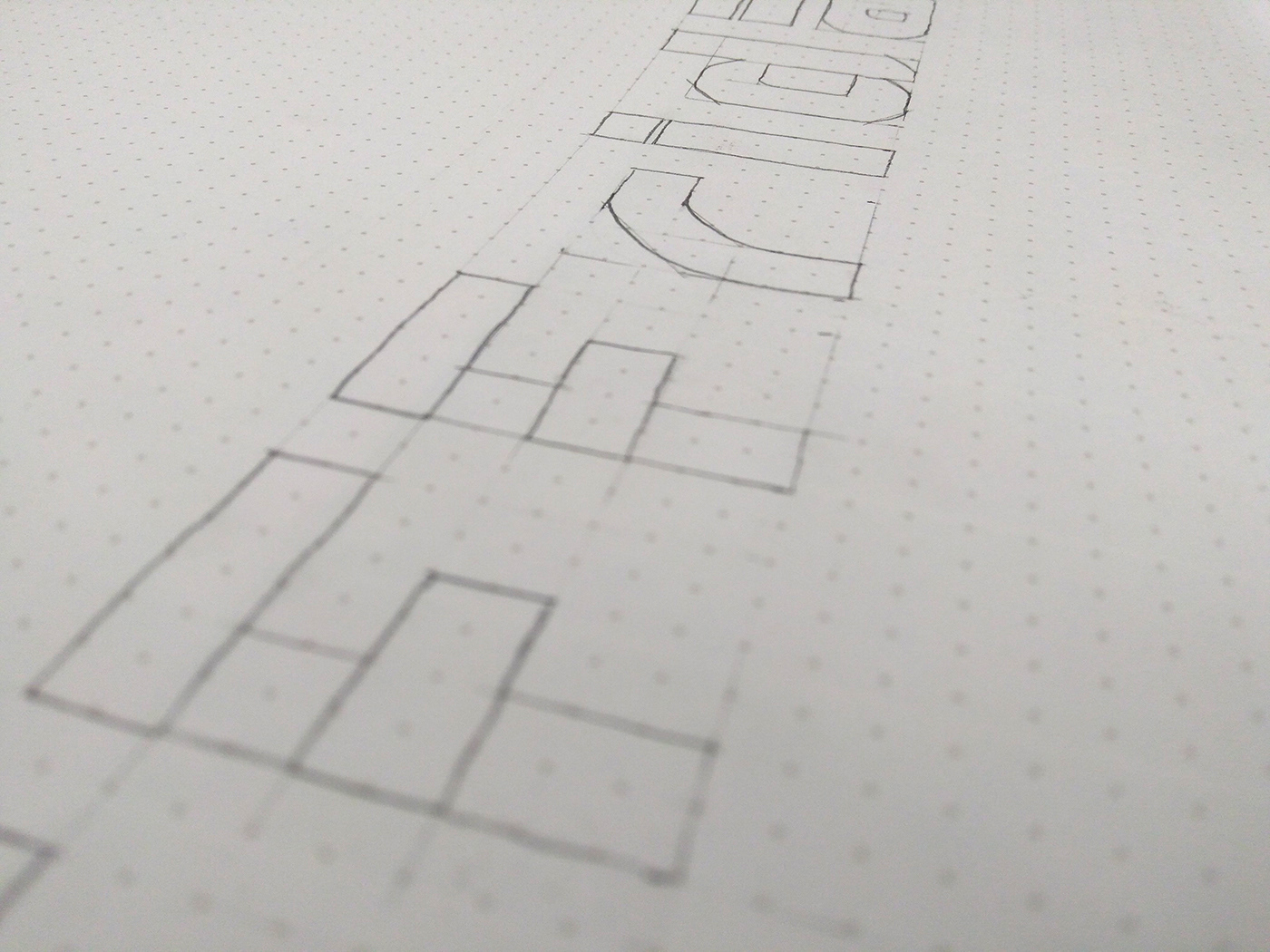
Sketch
Final version
White Space
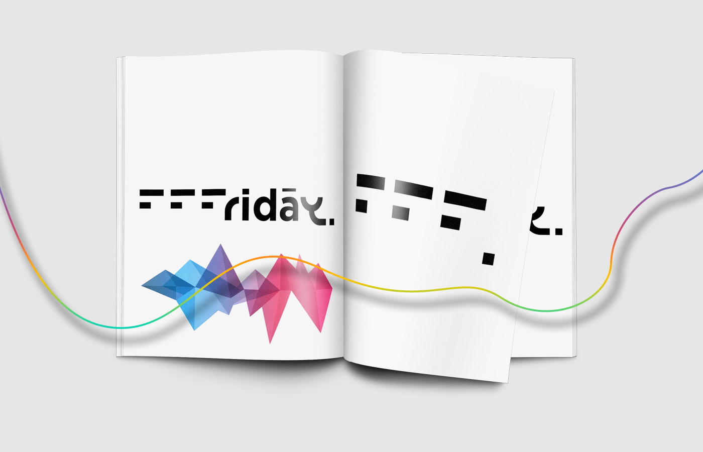
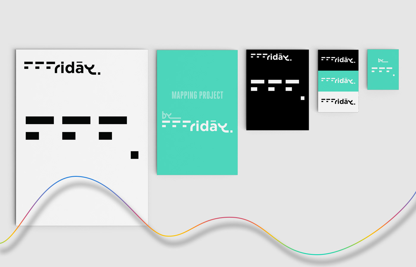
Typography that exists in the white space. First three letters. You are looking at the uppercase version of the letter F. I guess that from now on, you’ll have difficulty not seeing it. It’s not a trick. It’s an example of the transformative idea that lies next to elegance. From now on, whenever you see similar patterns, your brain will try to puzzle the missing information automatically for you. I am sorry, but there is no way back.
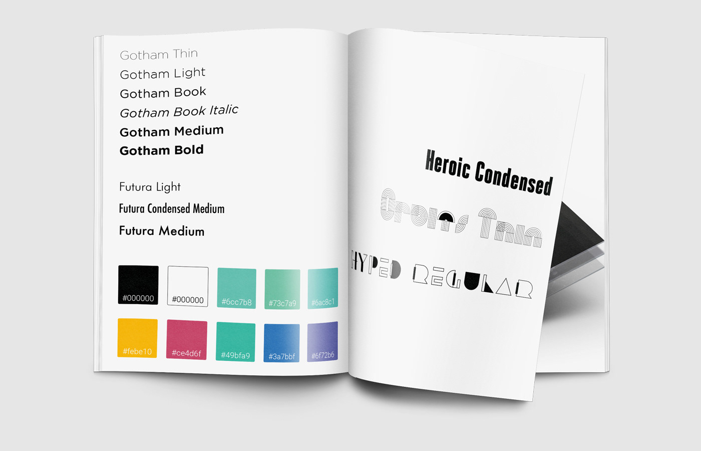
Typography design
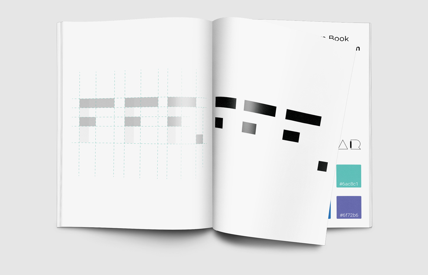
Colour code for white
#FFF is the colour code for white colour. Apart from a lot of important functions of this colour, white also provides a breathing space and it closely collaborates with an invisible design. Well, more than any other colour. And these are major players for this project.
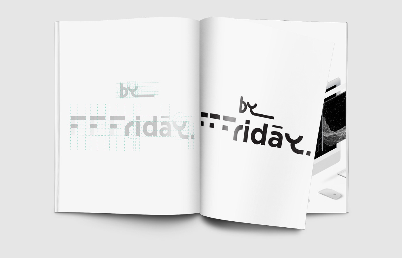
Typography that exists in the white space
Circle based typography
As this brand, or a project, is strongly related to user experience and also to an already existing identity - Du-Enter, I borrowed key elements from its design in order not to go very far, but maintain relationship and established principles between them. Typography is created out of circles in a symmetrical order dividing them by ½, ⅓ or ¼. I only used this technique for letters that support smooth curves and won’t affect readability, but will enhance the principle and purpose of this logotype.
Brand guide book
For the rest of the letters, I used Gotham Bold (i, d and a) as there is a great potential of Gotham taking on new typographic roles. A space-efficient text face with the silhouettes of a classic headline series. It’s a practical choice for any size with an ample character set that is recommended to almost any information environments. ScreenSmart version is specifically engineered for screens and available on the web through the web font solutions to ensure outstanding rendering on screen at all sizes. ScreenSmart is equipped with a set of detailed “hints”, which tell its outlines how to adapt themselves to grids to maintain legibility and personality.
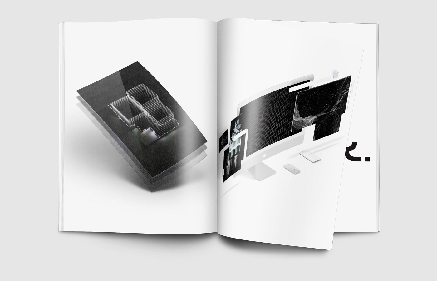
Video mapping production examples
ā
The macron is used to denote a long a and to indicate a mid-tone. As such, ā is an elemental symbol within an agreed set of symbols and it is considered to be a unique mark that collectively adds up to the spelling of a word or otherwise contributes to a specific meaning of what is written, depending on its cultural and social usage. After investigation, I believe that the chosen word is easy to understand or pronounce and by adding this unique mark I want to highlight not only a working routine, passion and inspiration for this project but also a potentially strong Friday’s usage. The logotype is designed to ignore excessive graphics and concentrates on its essentials in order to communicate its function or idea.
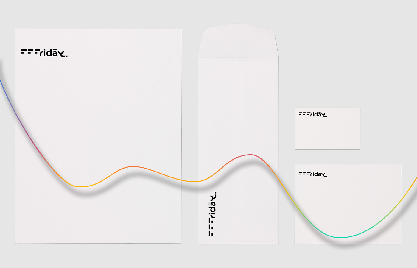
Visual identity on paper
Leaflet
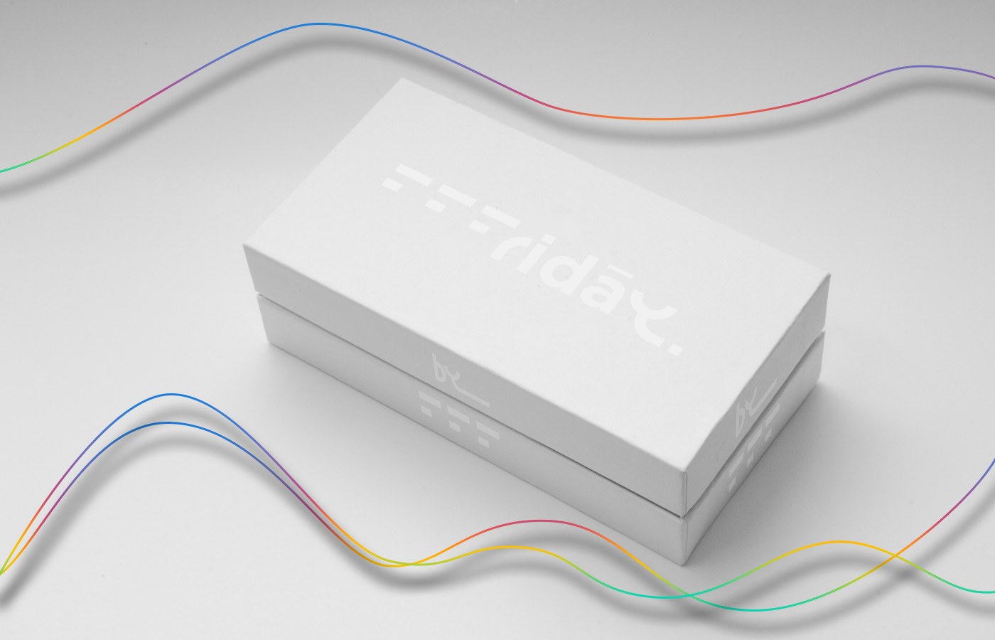
Branded box
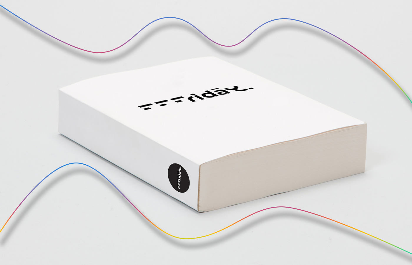
Manual
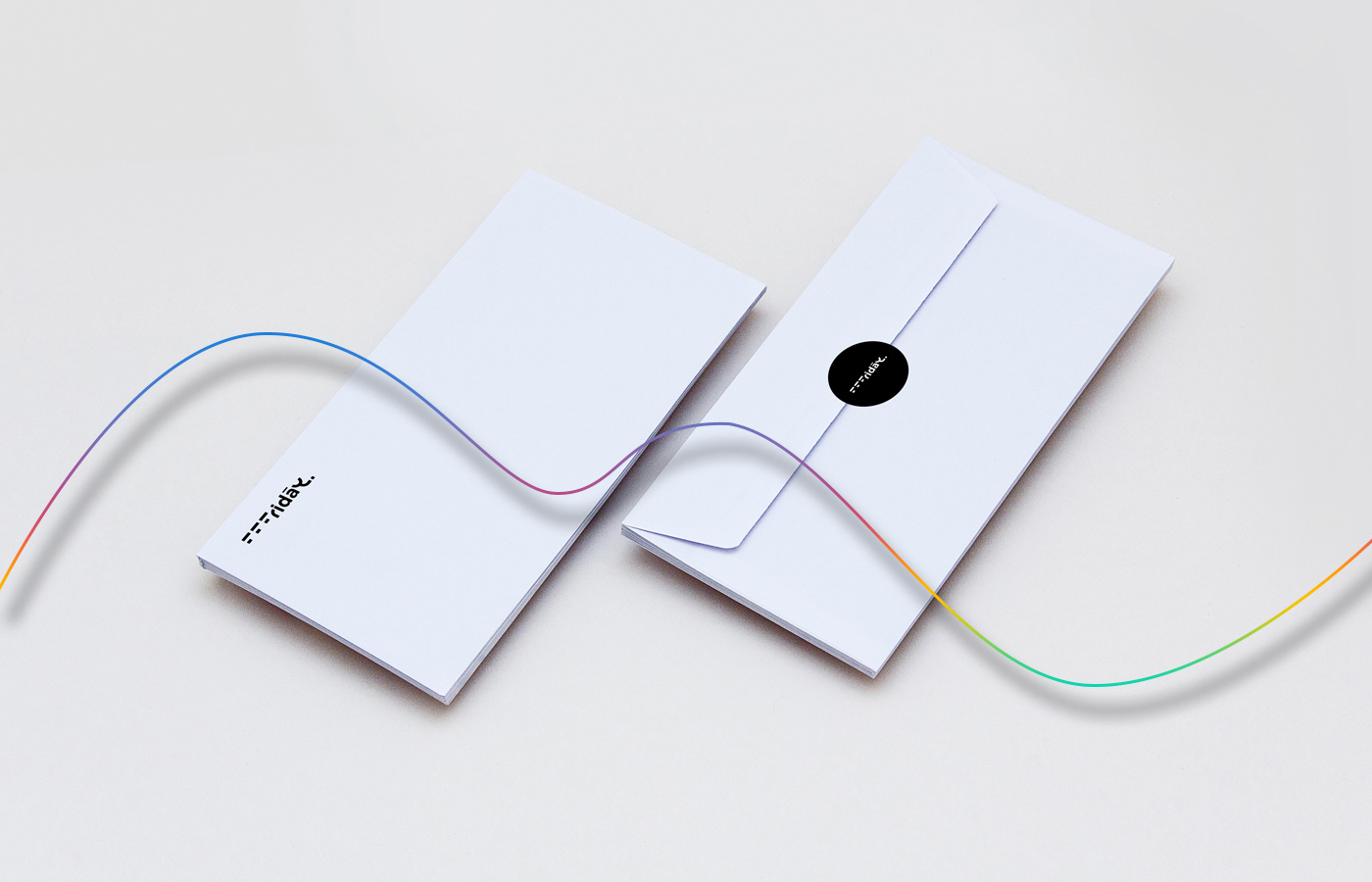
Envelope
Envelopes
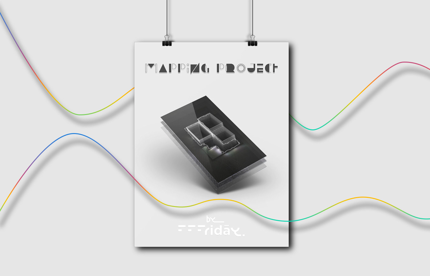
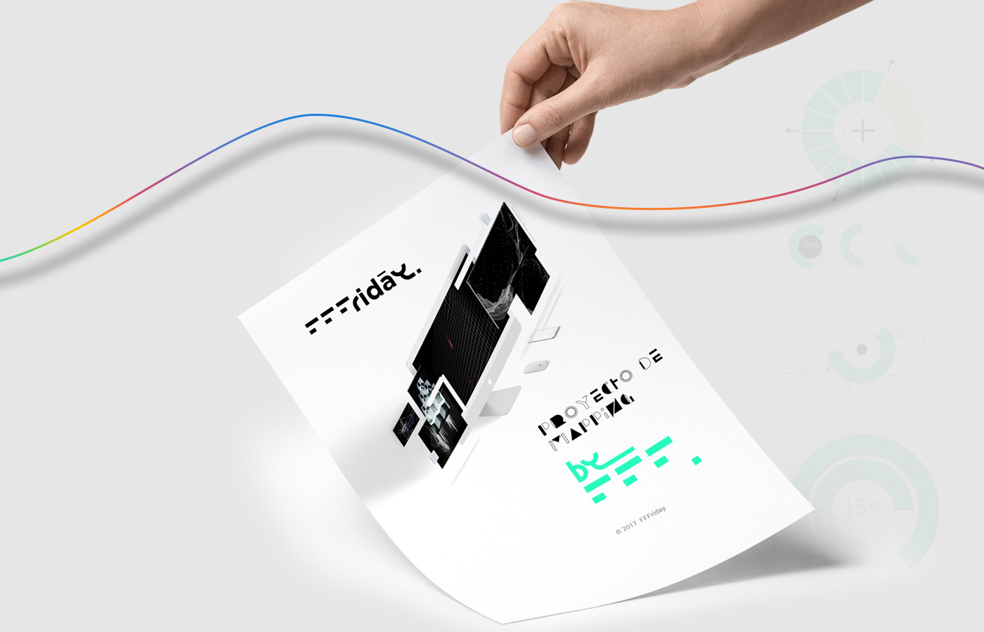
Promotional poster concept
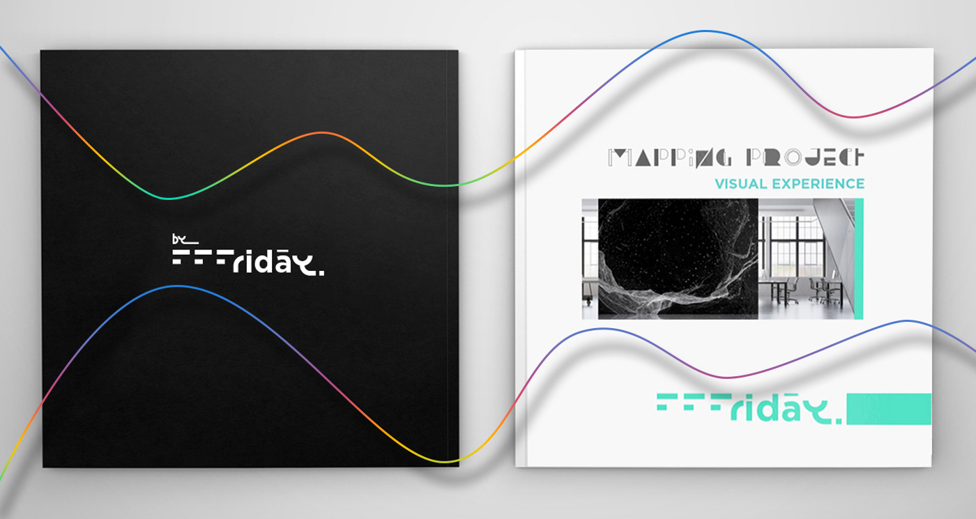
Book of visual experience
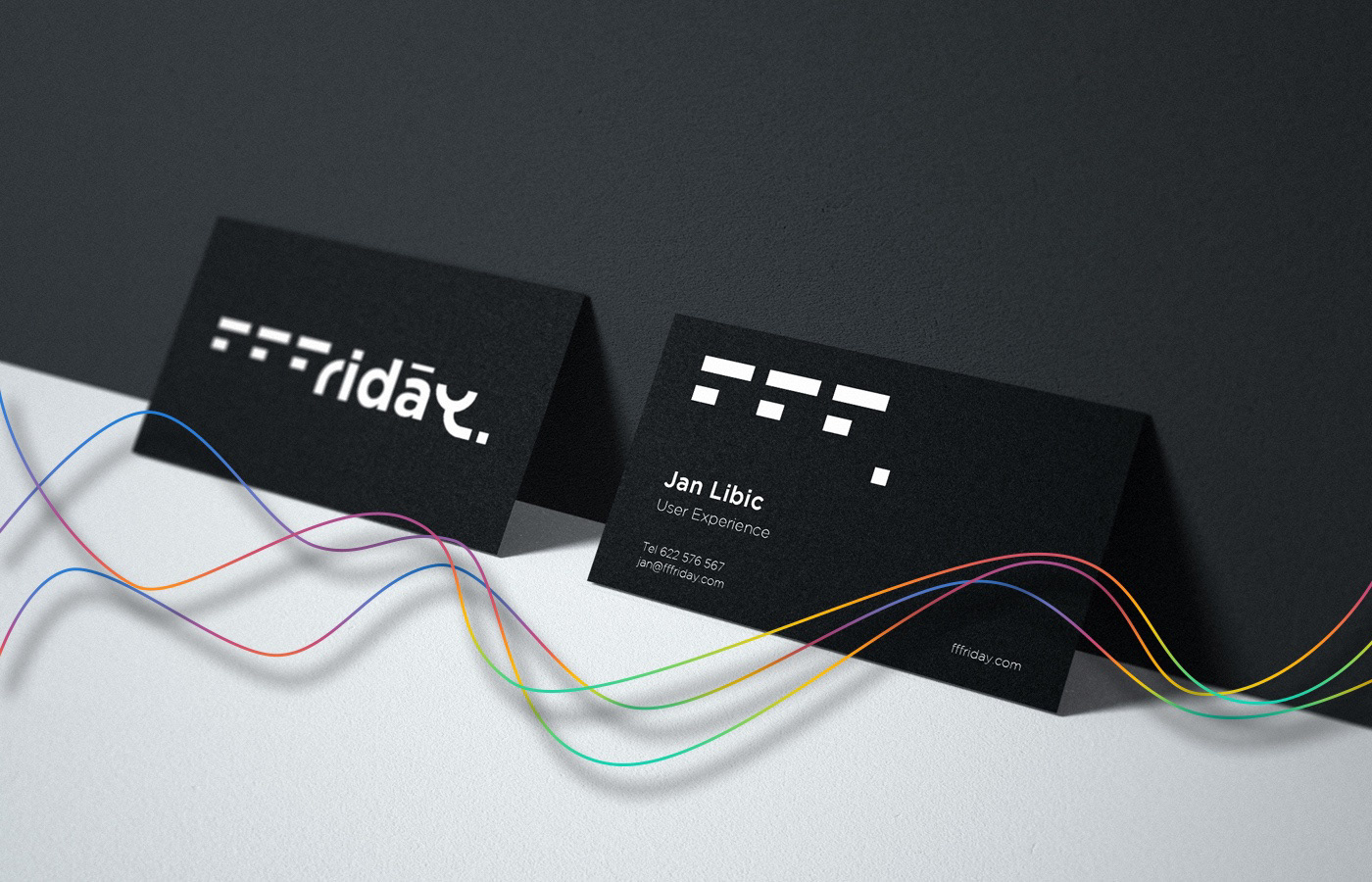
Business card
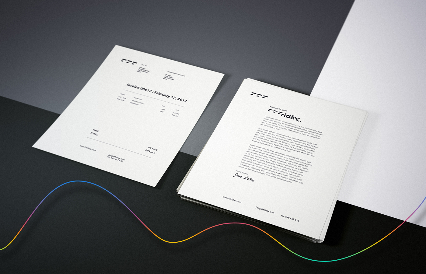
Invoice & resumé
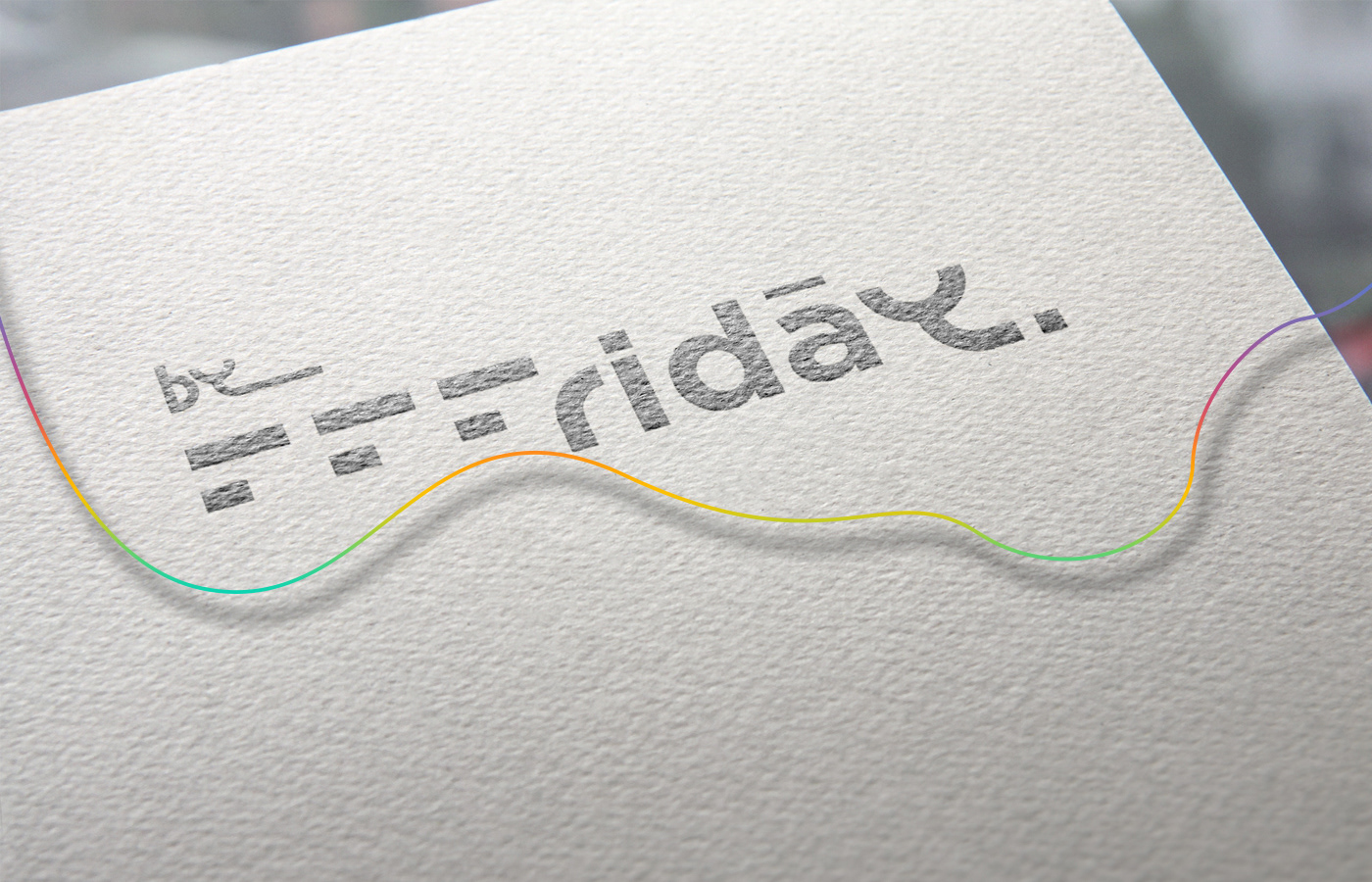
Printed version
The logotype is designed to ignore excessive graphics, but to concentrate on its essentials to communicate its function or idea.