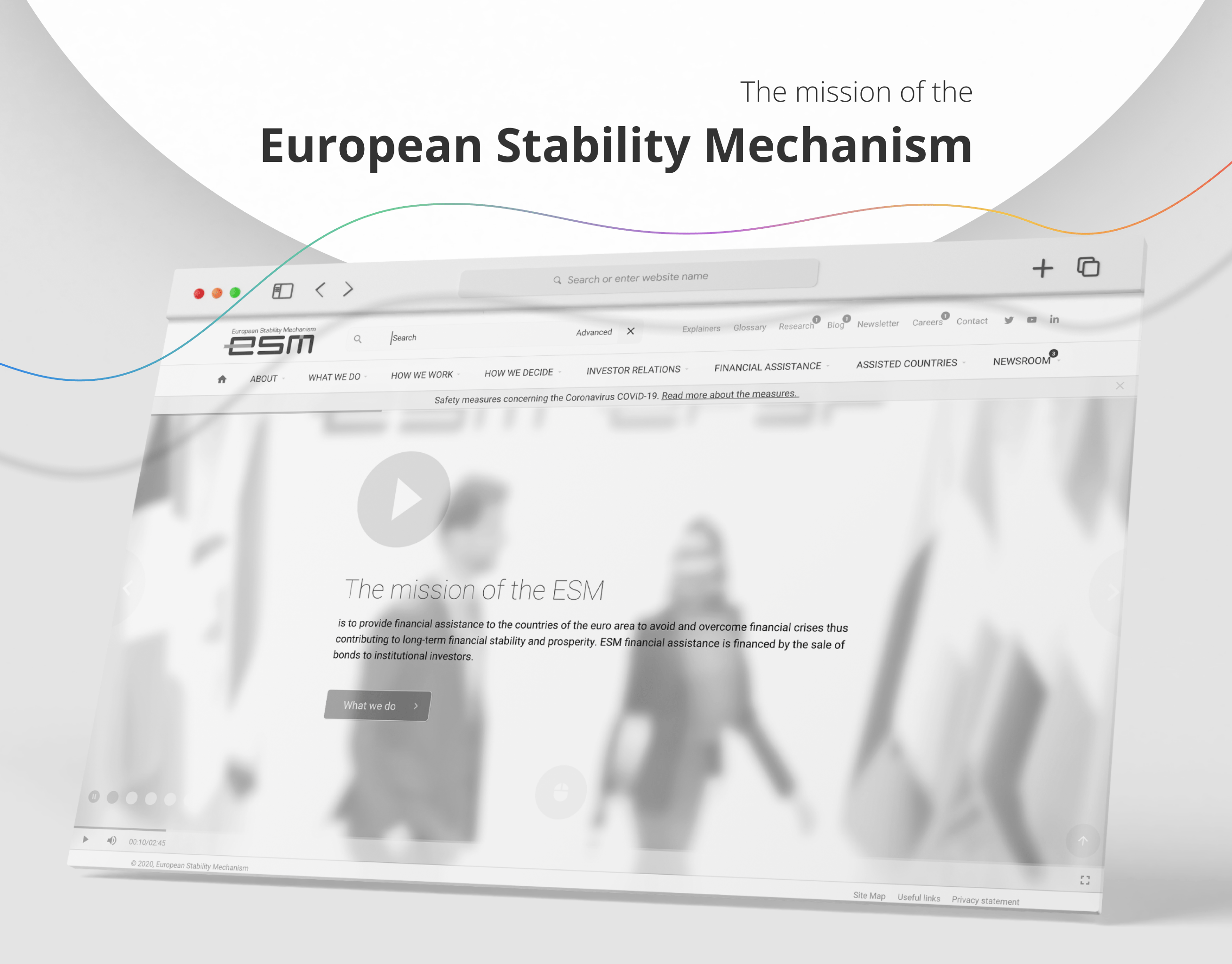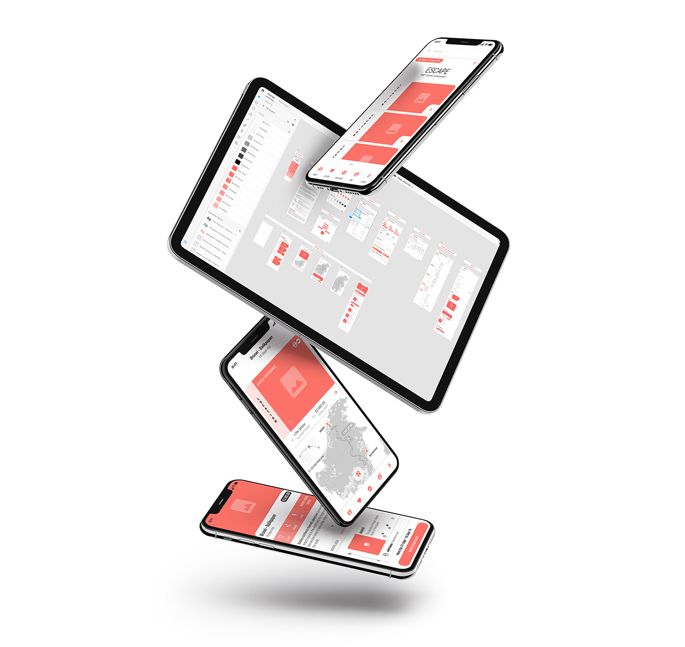
360º Travel Companion • Design System
The consistent user experience that serves and includes two distinct & conflicting user groups.
Over the years, decades, I have participated in projects of all kinds with one simple objective. Conversion improvement. There weren’t that many projects not conversion orientated. One normally does workshops, research, testing, prototyping, data-driven decisions, well you name it. Every project requires a slightly different approach. However, I have never in my career worked on a project that considered conflicting user groups – left versus right-handed. I should say I normally post-process a lot of collected data, but this bump never came to me via recorded research, nor did I consider this different need to be so important like I do today.
I am imagining a lot of conflicting user groups living in different contexts. Imagine products that need accommodating two-sided marked under one umbrella, guest vs. host or buyer vs. provider- two users with distinctly different needs and motivations. However this user case is referring to inclusive design – two users with the same needs and motivations, but different human capabilities.
This design system is about the understanding of creating an optimal experience for travel junkies, considering two-sided marked, multi-dimensional design (map user experience) but in this case, I am exploring maximisation of the inclusive design and experience if you like, within a set context.
The modules & components I design & use are already tested approaches and what I do is to keep polishing them along the way. The harder bit is to tweak the proved user experience and make it compatible with the mentioned conflicting user group. There are still fractions of proposed user experience that contradicts inclusive design concept but additional actions such as swipes are included to satisfy certain needs for this particular group of users and perhaps more.
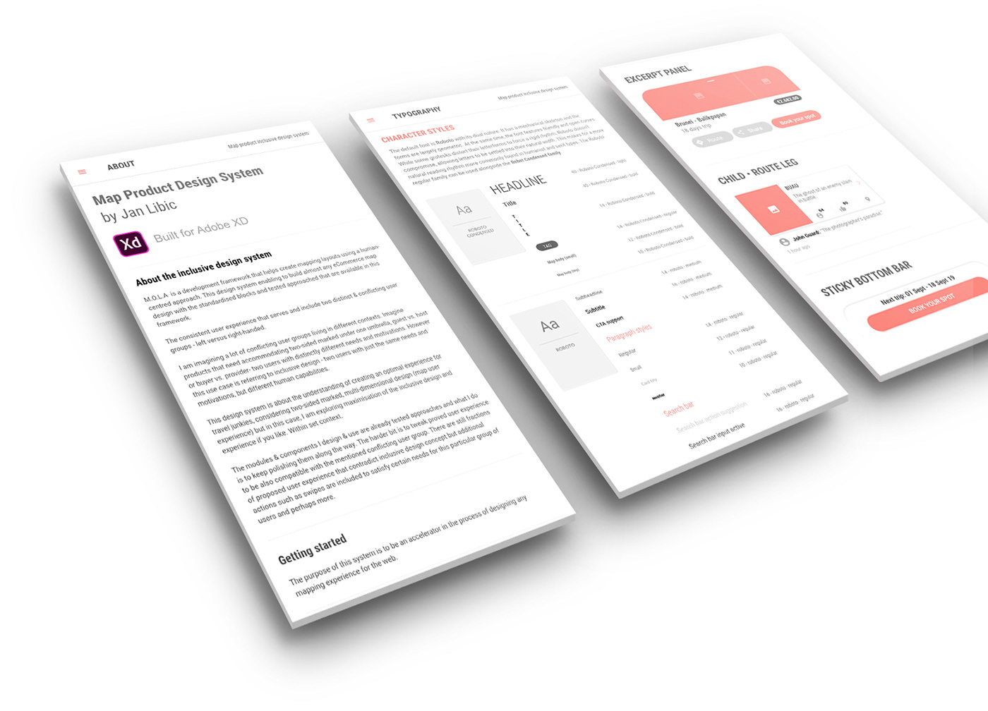
About the Design System • Typography and character styles • Components
HUMAN-CENTRED DESIGN SYSTEM
I started actively working with design systems. It became an obsession and a new habit of mine. At the end of the day, the technology is, finally, perfectly prepared for these approaches so why not to dig deeper? It doesn’t cost a lot. Yes, to shift the design thinking chip does cost something. I created a source document, master file if you like, with thoroughly selected elements I tend to re-use due to its popularity, modules that have successfully passed through testing or real-life positive experiences that helped me solve users' problems within their contexts.
The objective was and is to push those even further with every opportunity and no effort required, which of course design system allows you to do. Over time, this has converted into the human-centred framework which is enabling me to scale the standardised modules and already tested approaches.
“One can’t go wrong here. Yeah right.”
The product design process became far more productive having the concrete base one can work with, but the design process remains the same. Users' context will be different with each project and no design system nor framework is capable of accommodating different context at the time. Not today.
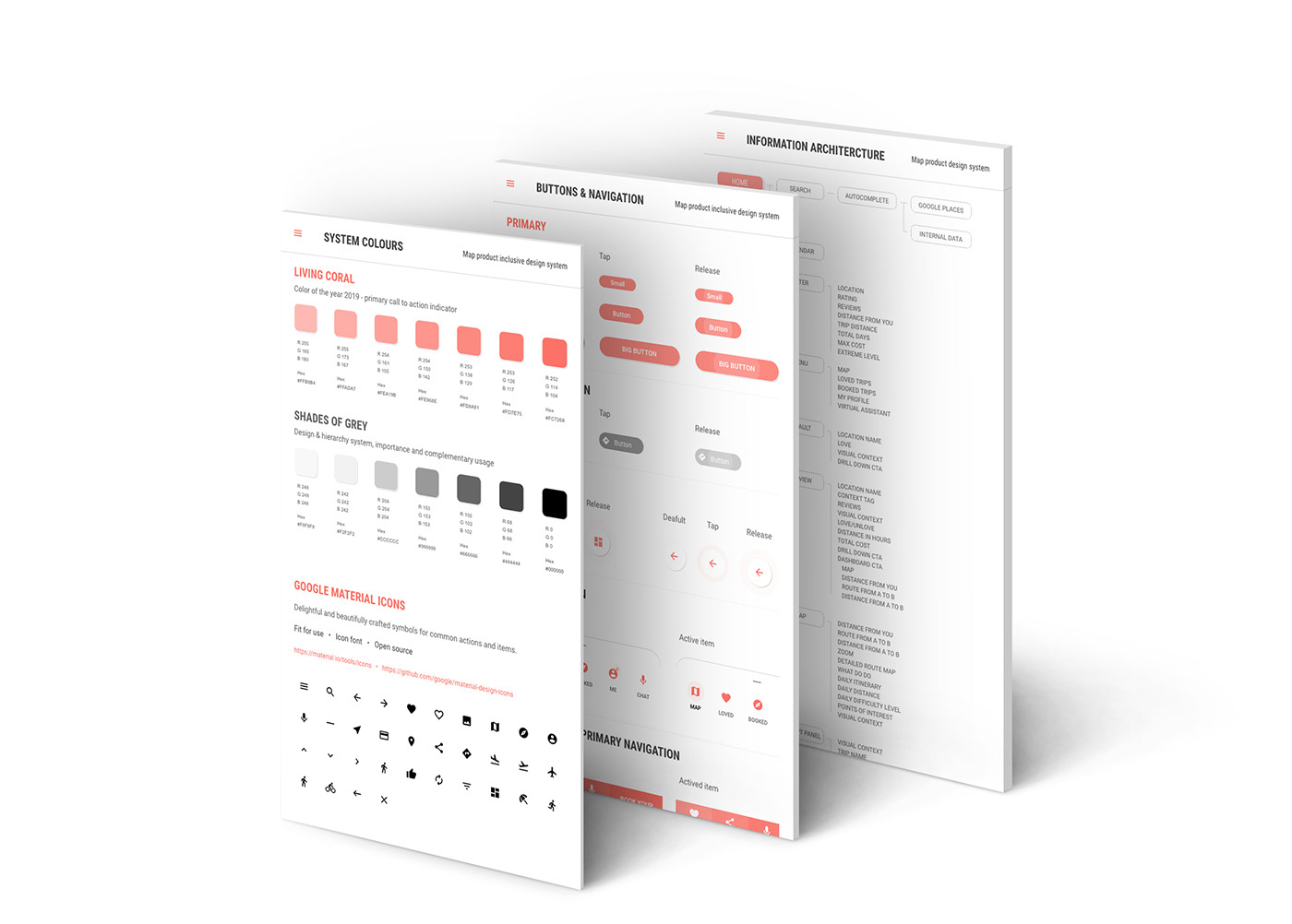
Living Coral & shades of grey system colours • Buttons & Main Navigation components • Information architecture
HOW I APPROACHED & CREATED A HOLISTIC EXPERIENCE
Each approach offers a consistent experience for both user groups. Such experience does leverage and builds on the specific needs of each group. The system is answering user-parallel needs that transcend conflicting capabilities. The difference in human-capability is attended primarily by added functionality that serves both groups at the same time and I am seeing it as the key to the meaningful solution.
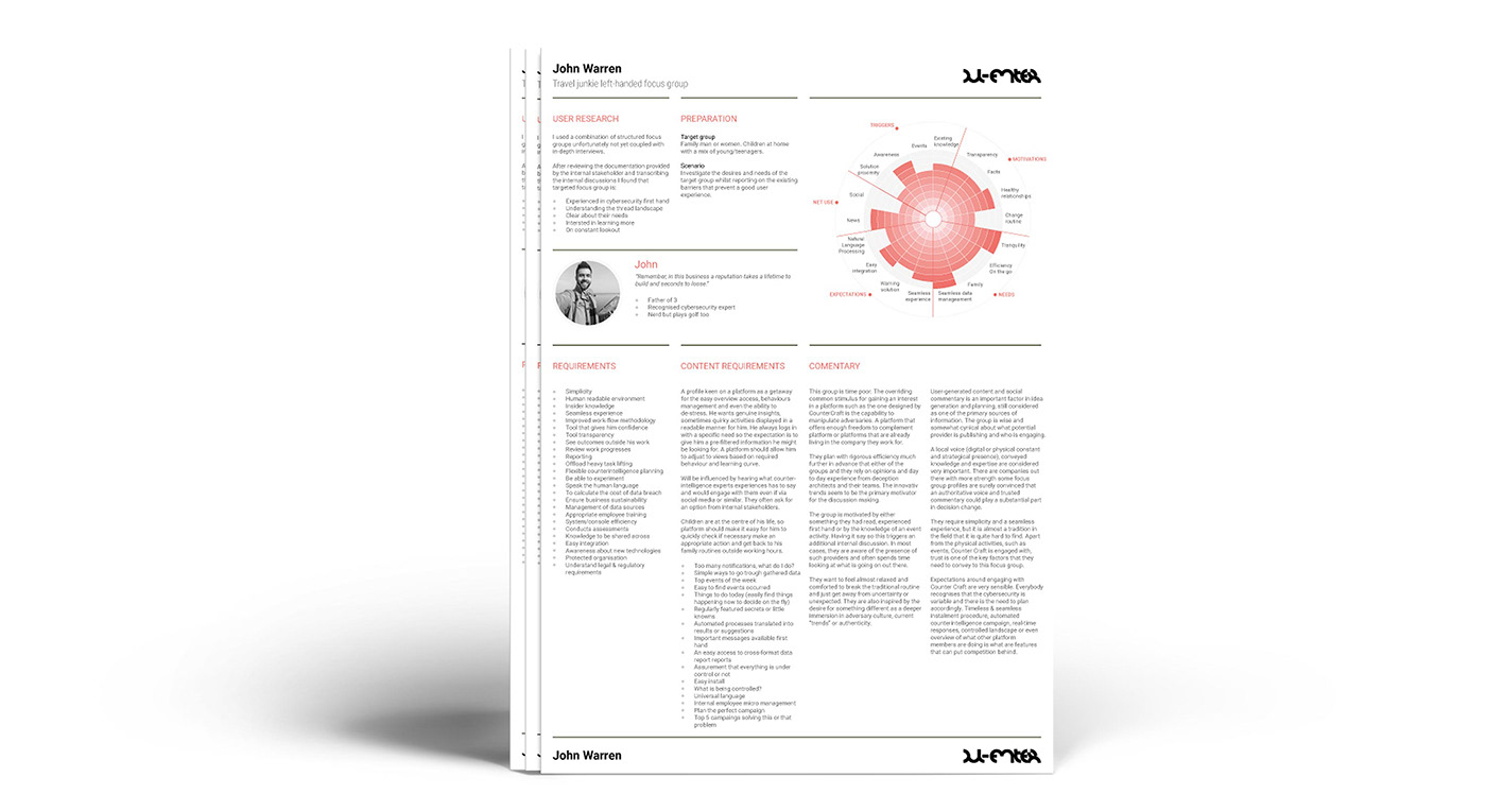
Persona models • Uncovering triggers, motivations, needs, expectations or online content consumption modelling
CONTEXT AND CONTEXTUAL NEEDS
I primarily work with enhanced and personalised map products. The map provides multi-dimensional-design experience by its nature, capable of providing information in real-time… and what’s most important is that the map is capable of satisfying contextual needs and helps the user to decide with less effort. While almost everything is about users' context, this design system is leveraging the map experience and exploring multi-dimensional design capabilities.
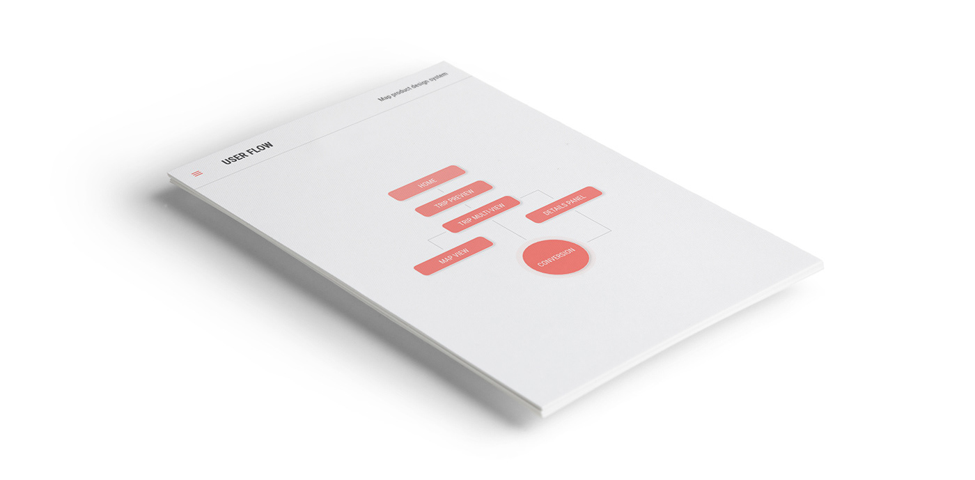
User flow • This is how simple it can get taking advantage of the multidimensional design approach
PROTOTYPE
INTRO
One-off content load
ROUTE PREVIEW
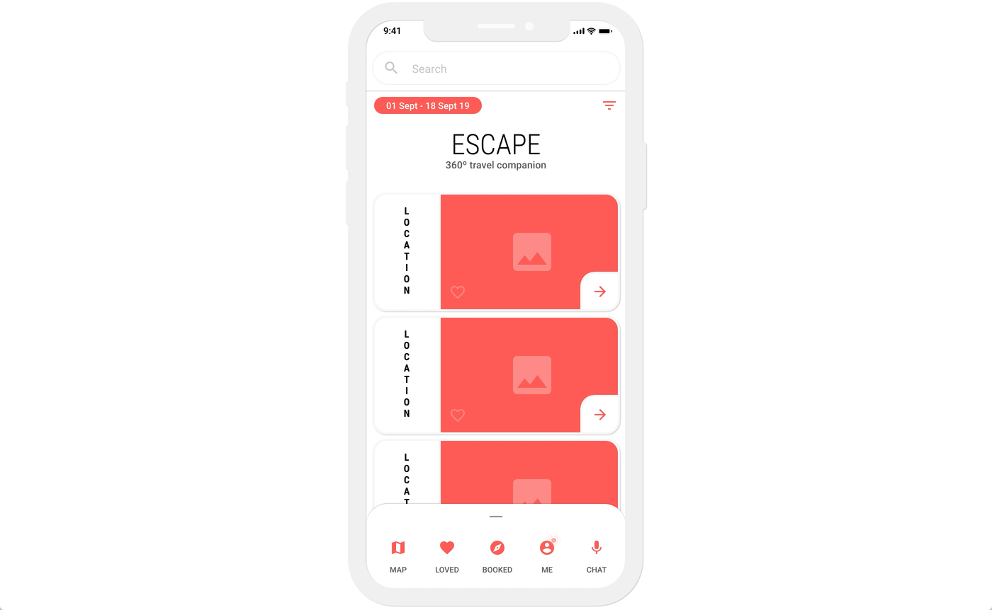
Contextual preview by tapping or swiping on the route of interest
SELECTED ROUTE MULTI-VIEW
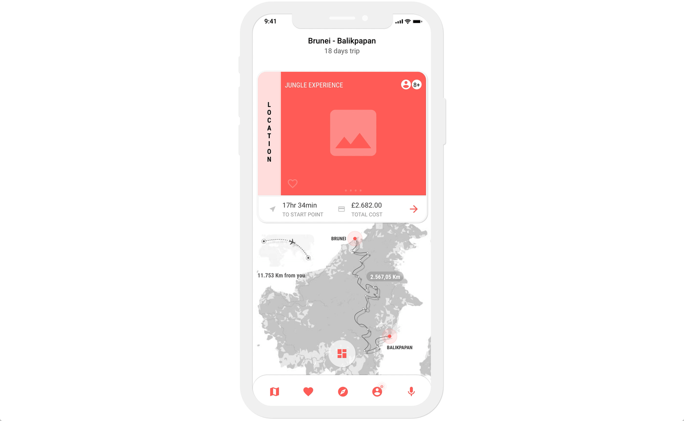
Selected location and route with prioritised map content providing full geographical information, points of interests, total trip distance or distance from your current location. The swipeable panel is providing more visual context and excerpt for the hidden details panel.
MAXIMISED OPERATIONAL SPACE OF THE MAP
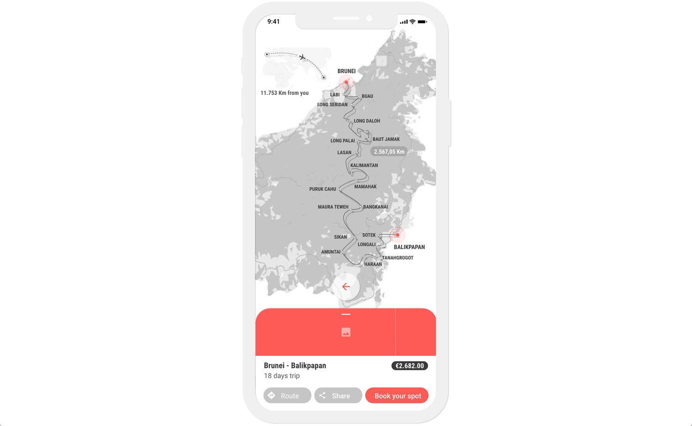
Maximised map content
DETAILS PANEL
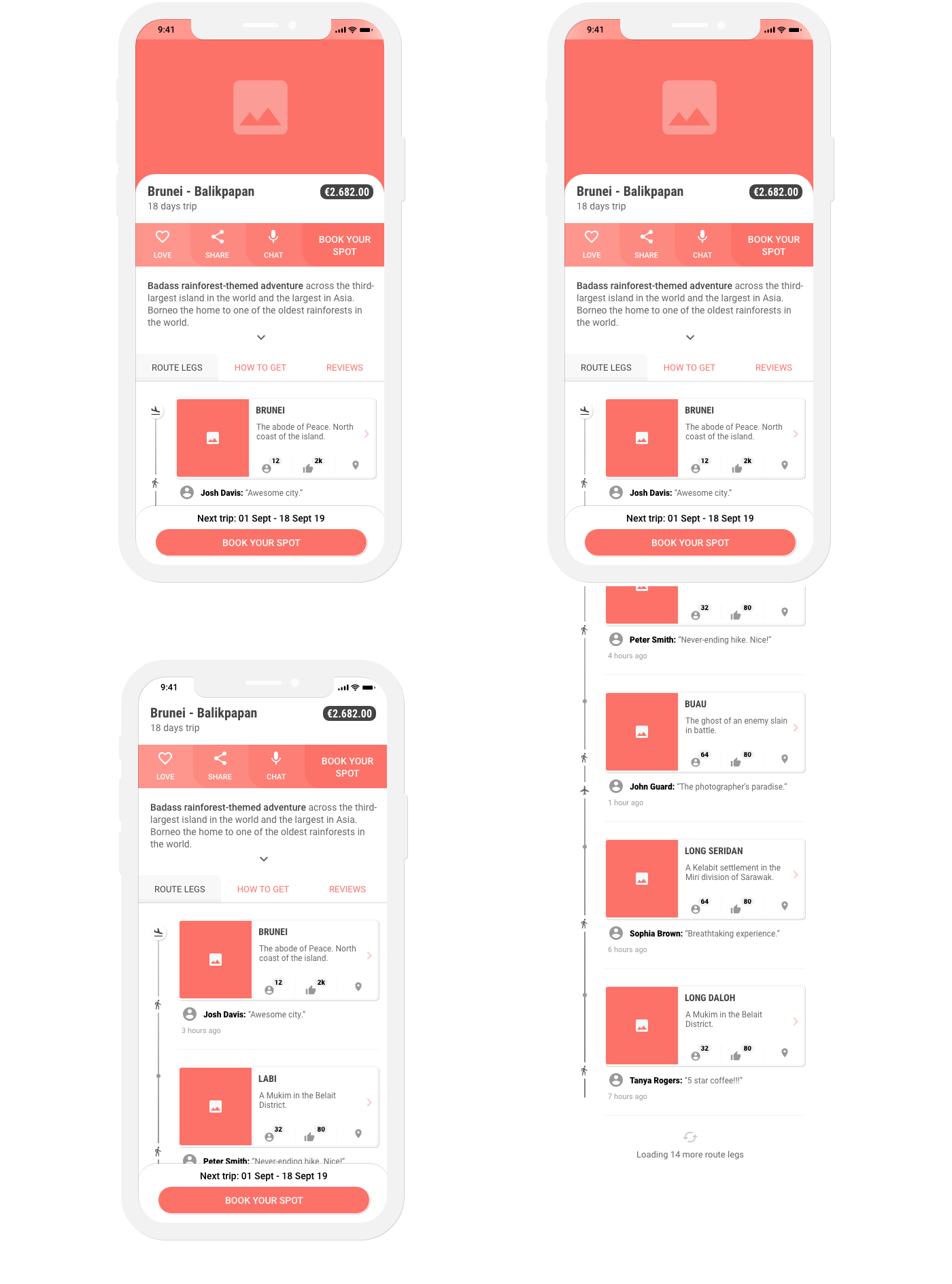
Details panel • Photo gallery • Sticky navigation bar • Route legs • Acess to the virtual assistant
CONCLUSION
There aren’t insides, at least not on my desk, that formed the concept of this project, but producing it in my personal time made it possible to explore it. The framework enabled me to satisfy conflicting needs and provide experience independence with added product abilities which at the end of the day are no costly at all. I simply wanted to polish certain parts of the product experience and this design system allows me to do so. I am not saying that this solution is the key to success, this wasn’t my goal at all. I wanted to achieve a both-sided seamless experience that is relevant and meaningful to the conflicting groups. This human-centred framework is a living document and the first thing I do every morning is to open it, if not already open.
NEXT CHALLENGES
But what happens when the two users differ? Not only in terms of functional needs, but also in terms of their underlying behaviour with digital products and technological perceptions?